
WordPress Alt Text Decision Guide: Decorative, Informative, Functional and Complex Images
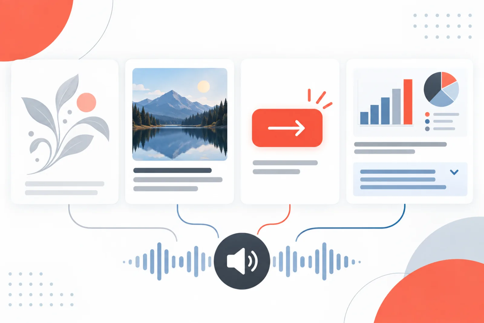
Good alt text describes the image’s purpose in its current context—not everything a vision model can see. The same photograph may need different alternative text on a product page, a news article and a linked card. Some images need an empty alt attribute; some need the action they perform; complex charts need a concise alternative plus nearby detail.
This decision guide turns accessibility principles into a WordPress publishing workflow editors can apply consistently.
Start with the question the image answers
Read the surrounding heading, caption and paragraph. Ask what information would disappear if the image did not load. Write the smallest alternative that preserves that purpose without repeating adjacent text.
| Image role | Alt-text approach | Example |
|---|---|---|
| Decorative | Use an empty alt="" | A flourish already conveyed by layout |
| Informative | State the relevant information concisely | “Checkout error after coupon submission” |
| Functional | Name the action or destination | “Download the accessibility checklist” |
| Complex | Give a short summary and a nearby detailed equivalent | Trend summary plus a data table |
| Text in image | Include essential visible wording if it is not elsewhere | Event date shown only in a poster |
Decorative images need an empty alternative
Decorative does not mean unimportant visually. It means the image adds no information or function beyond nearby content. An empty alt attribute tells assistive technology to skip it. Omitting the attribute entirely can cause some tools to announce the filename, which is worse than silence.
Background images used purely for styling generally do not need a text alternative. If a CSS background carries essential information, move that information into real HTML content.
Informative images need context, not keyword lists
Describe the detail that matters to the page. “Person using laptop” may be accurate but useless in an article showing a WordPress error. “Plugin update screen showing a compatibility warning” preserves the relevant meaning.
Avoid starting every description with “image of” or “picture of”; screen readers already announce an image. Identify the medium only when it matters, such as a diagram, screenshot, painting or photograph whose form affects interpretation.
Functional images describe the result
When an image is the only content inside a link or button, the alternative text should communicate what activating it does. A logo linked to the homepage can use the organization name plus “home” if needed. A printer icon button should say “Print invoice,” not “printer.”
Do not duplicate visible button text. If an icon and label are both inside the same control, the icon can normally be hidden from assistive technology.
Charts and complex images need two layers
Alt text cannot carry an entire chart responsibly. Provide a concise takeaway in the image alternative, then put the underlying values or a full explanation in nearby text, a table or a clearly linked description. Preserve axis units, comparison period, direction and important exceptions.
WordPress implementation details
WordPress stores an attachment’s default alt text in _wp_attachment_image_alt, but blocks and page builders may store an image-specific alternative in content. Updating the Media Library field does not guarantee that every existing instance changes. Review the rendered HTML for important templates.
Do not use the title, caption and alt field as interchangeable duplicates. Captions are visible editorial content; titles help manage assets; alt text supplies a text alternative for the rendered image.
A six-question editorial review
- Is the image decorative, informative, functional or complex here?
- Does nearby text already communicate the same information?
- Would a user understand the action or takeaway without seeing it?
- Did we avoid unsupported identity, emotion, ethnicity or medical inferences?
- Is essential text embedded in the image reproduced accessibly?
- Does the final rendered element contain the intended attribute?
Patterns for common WordPress content
For product photography, describe the visible attribute needed to choose the product—such as color, angle or included part—without repeating the full product name. For tutorial screenshots, name the state or error the reader should locate. For author portraits, use the person’s name only when identity is known and relevant. For logos, identify the organization; when the logo is also a link, make the accessible name communicate the destination.
Featured images are especially contextual. A generic illustration beside a headline may be redundant and can be decorative; a documentary image central to the story needs a meaningful alternative. Test listing cards as well as article pages because themes may render the same attachment differently.
Audit the rendered site, not only the Media Library
Export attachments with blank alternatives to establish coverage, then sample templates to find copied block-level values. Automated accessibility scanners can locate missing or suspicious attributes, but a human must judge purpose and duplication. Navigate with a screen reader or inspect the accessibility tree for representative pages, menus, galleries, forms and product cards.
Create editorial examples for the four image roles and add them to the publishing checklist. Consistency improves when writers review real examples from their own site instead of memorizing a character limit.
Before-and-after examples
| Weak alternative | Improved alternative | Why |
|---|---|---|
| “Image” | “Site Health warning for oversized autoloaded options” | Names the relevant state |
| “Red button” | “Delete selected media” | Describes the function |
| “Chart showing results” | “Failed demo launches fell from 8% to 2% after capacity increased” | States the takeaway; full data still belongs nearby |
| “Decorative orange wave” | alt="" | Removes redundant noise |
Accessibility is more than an alt field
Text embedded in an infographic needs sufficient contrast and an accessible equivalent. Linked images need a meaningful accessible name and visible focus. Galleries need sensible reading order and controls that work by keyboard. Alt text cannot compensate for an inaccessible carousel, missing form label or chart whose underlying data is unavailable.
Use a repeatable decision sequence
Editors should make the same classification in the same order. First ask whether the image is inside an interactive control. If it is, the control needs an accessible name that describes its action or destination. Next ask whether removing the image would remove information from the page. If not, use an empty alternative. If information would be lost, decide whether a short phrase can replace it. When the answer is no, provide a concise summary and a nearby detailed equivalent.
- Identify the rendered context. Review the page, component, nearby heading and link destination, not the Media Library thumbnail alone.
- Classify the role. Choose functional, decorative, informative, complex or text-bearing. Record ambiguity instead of guessing.
- Draft the minimum equivalent. Preserve the useful meaning or action without narrating irrelevant visual detail.
- Check for duplication. Read the alternative with the adjacent caption and link label. Remove repeated wording.
- Verify facts and language. Confirm names, numbers, product variants and visible interface labels.
- Inspect rendered HTML. Make sure the final
img, link or button exposes the intended accessible name.
This sequence prevents a common failure: writing a visually accurate sentence before deciding whether any description is needed. Classification comes first because an excellent description is still wrong when the image is decorative.
Understand context with concrete examples
Consider one photograph of a solar installation. On a company About page, “Technicians installing rooftop solar panels” may communicate the work. On a case study whose text already says that, the image may add only atmosphere and can be decorative. On a safety-training page, the relevant alternative may be “Installer clipped to the roof anchor while working beside the panel array.” The pixels are unchanged; the communicative purpose is different.
A product image follows the same rule. “Blue backpack” is insufficient when the photo is the only way to distinguish a navy color option from black. “Navy backpack, front view, with two external bottle pockets” may support the buying decision. A second gallery image should describe what is newly visible, such as the padded laptop compartment, rather than repeat the product title five times.
For a technical screenshot, do not transcribe the entire interface. Name the state the instructions depend on: “Permalink settings with Post name selected.” If the user must locate a control, include its exact visible label and relative position only when that information helps complete the step.
Implement decorative images correctly in WordPress
An empty alternative is an attribute with no value: alt="". It is not a missing attribute, a blank Media Library title or the word “decorative.” When a theme prints an image without an alt attribute, some assistive technology may announce its filename or URL. Check the output generated by the theme, blocks and page builder.
Do not hide meaningful images using aria-hidden="true" merely to silence a poor accessible name. If the image carries information, supply an equivalent. If it is decorative and wrapped by no interactive element, an empty alternative is normally enough. For decorative SVG icons next to visible text, ensure the icon itself does not contribute a duplicate name.
Featured images deserve template-level review. A theme may output the same attachment on the archive card, at the top of the article and in a related-post component. One instance might be redundant beside the headline, while another conveys story information. If the system cannot express contextual alternatives, adjust the template or select wording that causes the least harm across known uses; document the limitation.
Handle linked images and icon controls
The accessible name belongs to the interactive element. If a linked logo is the only content in a link, “WPStack home” describes the destination better than “red stacked logo.” If an image appears beside visible text in the same link, use an empty image alternative when the text already names the destination. Otherwise a screen reader may announce the label twice.
Test keyboard focus and the accessibility tree. A CSS background used as a button icon has no inherent alternative, so the button requires visible text, an aria-label or another supported naming method. Do not put essential instructions only in a tooltip that appears on hover. The result must work for keyboard, touch and assistive-technology users.
Write alternatives for charts, diagrams and infographics
Start with the conclusion a sighted reader is expected to take away. Include the metric, direction and comparison period: “Median checkout time fell from 4.8 seconds in January to 2.1 seconds in June.” Then provide the complete values in adjacent text or a data table when individual points matter. The alternative should not become a compressed spreadsheet.
For a process diagram, describe the sequence and important branches in HTML. For a map, state the location or route the task requires and offer an address or written directions. For an infographic with extensive text, provide the same information in a structured page section. A long description must be maintained whenever the graphic changes; assign an owner and version both assets together.
| Complex image | Short alternative | Detailed equivalent |
|---|---|---|
| Monthly performance chart | Main trend and material exception | Accessible data table with dates, units and values |
| Checkout flow diagram | Purpose and end state | Ordered steps with decision branches |
| Annotated screenshot | Task and highlighted control | Written instructions using exact interface labels |
| Event poster | Event identity if useful | Date, time, location and registration details as text |
Avoid sensitive and unverifiable claims
Describe observable facts relevant to the page. Do not infer a person’s identity, gender, ethnicity, religion, health, disability, emotion or relationship unless reliable editorial context establishes that information and it is necessary. “Person speaking at a podium” is safer than inventing a name or emotional state. Known public figures can be named when identity is verified and central to the content.
Take similar care with screenshots and documents. Alternative text should not expose private account numbers, email addresses, medical information or internal tokens that were accidentally captured. The correct remedy may be to replace or redact the image, not describe the sensitive content more accurately.
Account for language and localization
Translate meaning, not just words. A localized page may use a different product name, interface label or cultural reference. If WordPress stores one global attachment alternative, changing it for one language can harm another. Determine whether the multilingual plugin creates translated attachment metadata, copies the block value or reuses one field across languages.
Give local editors the image context and the underlying facts. They should write natural alternatives in the page language and preserve official UI terminology. Check right-to-left layouts, localized screenshots and text embedded in images. A screenshot of an English dashboard may not be an accessible substitute for an Arabic tutorial even if its alt text is translated.
Build a site-wide audit without rewarding the wrong metric
Begin with rendered templates and high-value journeys: navigation, home page, product discovery, checkout, forms, account screens and top articles. Inventory missing alt attributes, empty alternatives, filename-like values, duplicate phrases and unusually long descriptions. Those signals prioritize review; they do not determine correctness.
Sample every major image role and content source. Include Media Library values, Gutenberg blocks, page-builder templates, custom fields, product galleries and theme output. Track intentionally decorative images separately so a “percent filled” dashboard does not pressure editors to give them noisy descriptions.
Useful measures include missing-attribute defects, classification completion, functional images with valid accessible names, complex images with maintained detailed equivalents, factual correction rate and template regressions. Pair automated scans with manual keyboard and screen-reader checks on representative pages.
Create an editorial standard and quality gate
Publish a one-page standard containing the decision sequence, site-specific examples, prohibited sensitive inference and escalation route. Add role-specific examples for products, tutorials, team profiles and marketing graphics. Train reviewers on disagreements; two reasonable writers may phrase an alternative differently while preserving the same useful meaning.
Before publication, require a reviewer to see the image in context, confirm classification and inspect the rendered result for functional or complex cases. Low-risk informative photographs can use sampling once quality is stable. Any automated draft remains unapproved until it passes the policy.
Diagnose frequent alt-text failures
| Failure | Why it happens | Correction |
|---|---|---|
| Filename announced | The template omitted the attribute | Fix output so decorative images use alt="" and informative images have a value |
| Link name repeats twice | Visible text and image alternative contain the same label | Make the image decorative within the combined link |
| Media Library update has no effect | The block or builder copied an older value | Update the stored instance and verify rendered HTML |
| Chart has a paragraph-long alternative | No detailed equivalent was designed | Use a short takeaway plus a maintained table or description |
| Every image receives keywords | SEO coverage was treated as the goal | Return to purpose and remove redundant or promotional phrasing |
When a systemic defect appears, fix the shared renderer before editing hundreds of records. A theme that drops empty attributes or a component that duplicates names will recreate the problem. Retest every caller of the changed template and retain a small automated accessibility check to catch regression.
Separate attachment metadata from page-level meaning
WordPress encourages reuse by storing a default alternative on the attachment, but accessibility is evaluated where the image is rendered. An editor may insert that attachment into a block and later change the block’s alternative without changing the library. A page builder may copy the value into its own JSON. A theme can ignore both and construct output from the title. Audit all three layers: source metadata, stored component data and final markup.
When one attachment has several purposes, prefer a component that supports contextual text. A corporate logo can be informative in a partner list, functional when it links home and redundant beside the company name. One global string cannot express those roles correctly. If the platform has only one field, document the compromise and prioritize the most important contexts for a template fix.
Keep accessibility and image SEO aligned
Search engines benefit when images, filenames, captions and surrounding content are coherent, but the alt attribute is not an advertising field. Do not append locations, services or product keywords that the image does not communicate. That makes screen-reader output noisy and can reduce trust without improving the page.
Use descriptive filenames before upload when practical, optimize dimensions and format for delivery, write visible captions when readers need provenance, and provide accurate page text. Let the alternative serve its accessibility purpose. For an image that links to a service, describe the destination; for a decorative SEO illustration, use an empty alternative even if the file has a descriptive name.
Run a focused quality review
Select twenty high-traffic pages across templates and build a worksheet with image URL, role, accessible name, nearby text, issue and owner. Review first without sight of the image using the accessibility tree: can the page’s information and actions be understood? Then compare visually to find missing meaning or redundant narration.
Fix shared component defects first, then page-specific values. Re-run the automated scan and repeat the manual journey with keyboard and screen reader. Close an issue only when the rendered page passes; a correct value in the database is not sufficient evidence.
Schedule another representative sample after every major theme, builder or accessibility-plugin update. Rendering behavior can change without altering attachment metadata. Preserve a few known decorative, functional, informative and complex fixtures so a release check can confirm each role still produces the intended markup and accessible name in production.
Retain the audit worksheet with the release record so future reviewers can reproduce each classification and rendered check.
How AI ALT Genius helps
AI ALT Genius uses computer vision to produce contextual draft descriptions for Media Library images and supports preview and editing before database changes. Bulk processing helps surface missing alternatives across a large archive.
Automation cannot determine page purpose reliably from pixels alone. Editors must still mark decorative images correctly, rewrite functional alternatives around the destination, add long descriptions for complex visuals, and reject uncertain claims.
Related WPStack guides
Frequently asked questions
Should every WordPress image have descriptive alt text?
No. Decorative images should normally have an empty alt attribute so assistive technology skips them.
How long should alt text be?
There is no universal character target. Be concise enough to avoid noise and complete enough to preserve the image’s purpose.
Does alt text improve SEO?
It can help search systems understand images, but accessibility and user meaning come first. Keyword stuffing makes the alternative worse.
Can AI publish alt text automatically?
For low-risk, repetitive archives it may accelerate drafting, but important, functional and complex images should pass human review.
References
- W3C image alt decision tree
- W3C images tutorial
- WCAG 2.2 Understanding non-text content
- WordPress: wp_get_attachment_image()

Aditya Bhimrajka is a technology entrepreneur, product strategist, and software solutions expert with over a decade of experience building scalable web and mobile applications. His expertise spans SaaS, AI, cloud technologies, custom software development, and digital transformation. Passionate about solving real-world business challenges through technology, Aditya shares practical insights on WordPress, plugins, software development, startup growth, product strategy, and emerging technologies. At WPStack, he writes actionable, experience-driven content that helps developers, businesses, and website owners build secure, high-performing, and future-ready WordPress solutions.