How to Write Alt Text for WordPress Screenshots and Technical Tutorials
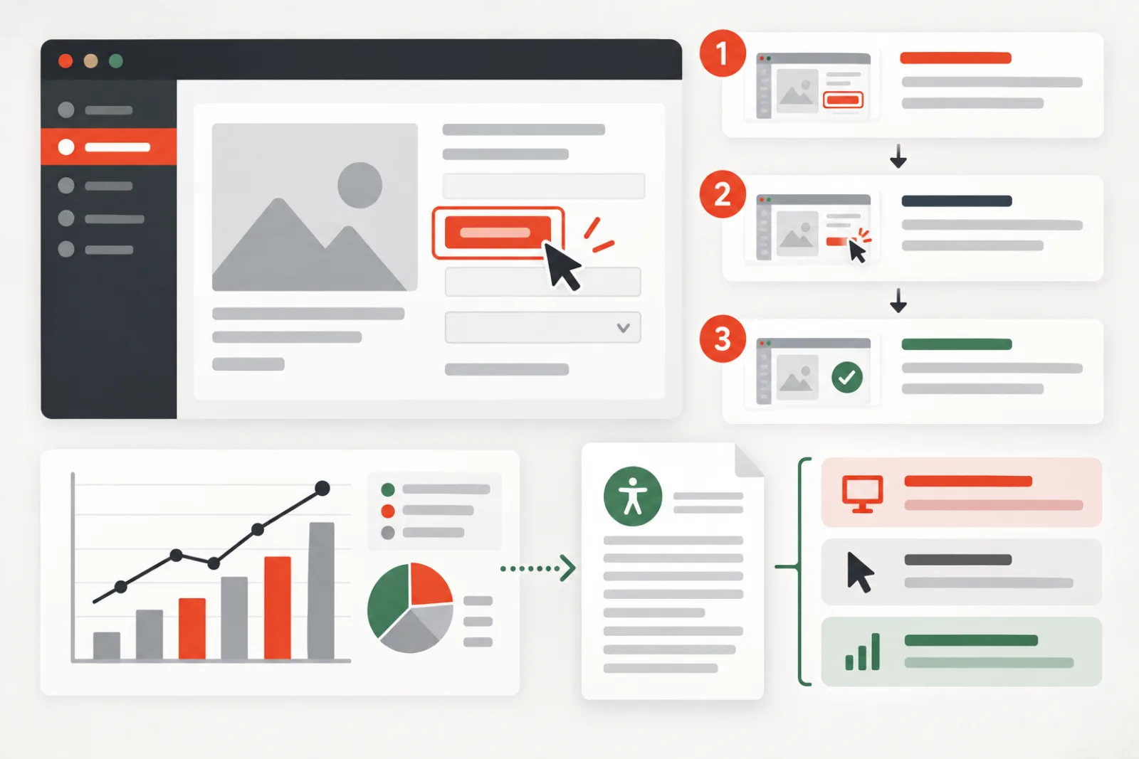
Alt text for a tutorial screenshot should communicate the interface state or action the reader needs—not inventory every visible menu and button. If the surrounding step already says what to click, the screenshot may need only the crucial state, result or location. Complex interfaces and charts often need visible supporting text beyond a single alt attribute.
Decide what the screenshot contributes
Ask: if the screenshot failed to load, what would prevent the reader from completing the task? That answer is the semantic payload. It might be the location of a control, the selected setting, an error message, a before/after difference or confirmation that an action succeeded.
| Screenshot purpose | Alt-text job | Better support |
|---|---|---|
| Locate a control | Name the screen and control location briefly | Repeat the control label in the written step |
| Show a setting | State the important selected value | Provide the value in visible text |
| Show an error | Include the relevant error meaning | Quote the full error nearby if needed |
| Compare before and after | Describe the meaningful change | Use two labeled figures or a visible summary |
| Display a chart | Identify the chart and main conclusion | Add a table or long description |
| Pure decoration | Empty alt | No annotation required |
Write the tutorial step first
A tutorial should still work in text. Write the action using the exact accessible control name, expected result and any prerequisite. Then add the screenshot as reinforcement. If the only instruction is a red arrow inside an image, users who cannot see the image—and search systems trying to understand the procedure—lose the step.
For example, visible copy can say: “Open Settings, choose Permalinks, then select Post name and save.” The screenshot alt can focus on the resulting state: “Permalink Settings with Post name selected.” It need not repeat every instruction.
Use interface, target and state
For many screenshots, a concise structure works: interface or page + target + important state/result. “Plugin settings page with dry run enabled and Delete disabled” is more useful than “Screenshot of WordPress admin.” Omit “image of” or “screenshot of” unless the fact that it is a screenshot matters to interpretation.
Handle annotations accessibly
Arrows, boxes and numbered callouts are visual aids, not alternatives to text. Use high contrast and do not rely on color alone. Match callout numbers with a visible ordered list. If an annotation says “click here,” name the control in the article. Keep sensitive tokens, email addresses, customer data and server paths out of captured images and alt text.
Errors, code and terminal output need text equivalents
If the screenshot contains an error readers may search for or copy, include the significant message as selectable text near the image. For code or commands, use a code block rather than embedding the only copy in pixels. Alt text can summarize the state: “Deployment log ending in a database connection timeout.” The adjacent text should contain the exact safe-to-share error and remediation steps.
Charts and diagrams need two layers
W3C guidance for complex images uses a short description plus a detailed textual equivalent. The short alt identifies the chart and its main takeaway; a nearby paragraph, table or linked long description supplies values, relationships and trends. Trying to pack an entire data table into an alt attribute creates an exhausting experience and is difficult to maintain.
Make each image unique to its step
Repeated admin screenshots with the same generic alt create noise. Give each image a clear job or remove it. Crop to the relevant region without removing orientation cues. If a UI changes frequently, describe the outcome more strongly than fragile pixel coordinates, and add the product/version and capture date to editorial notes.
WordPress storage can create stale alternatives
In the core Image block, alt is an attribute in saved image markup. Updating the Media Library default later may not reliably rewrite every existing block or builder instance. Elementor’s Image widget can use Media Library data while also allowing builder-specific behavior such as captions and dynamic images. Reusable templates may render one image across hundreds of pages.
Therefore, audit rendered HTML after editing. Check the tutorial post, reusable block or pattern, template, translated version and cached output. Do not assume a successful Media Library save changed historical content.
Review AI-generated screenshot descriptions
Vision tools can recognize visible controls but lack the author’s teaching goal. They may copy irrelevant interface text, expose personal data, misread a toggle state or describe the screen rather than the required action. Provide the article heading and tutorial step as context when the workflow allows, then review for accuracy, concision and privacy.
Worked example: API configuration tutorial
A screenshot shows an API settings page with endpoint, username and secret fields. A naive description transcribes the whole screen and risks exposing credentials. The final tutorial uses redacted sample values, visible text explaining where credentials come from, and alt text reading “API settings with the endpoint entered and connection test ready.” A second screenshot of the success banner uses “Connection test succeeded.” The actionable state is available without leaking the secret.
How AI ALT Genius fits
AI ALT Genius offers assisted, editable alt-text drafts for WordPress Media Library images and is designed around human review. It can reduce the blank-page work of describing a large screenshot archive.
Use it as a starting point: the tool cannot reliably know the tutorial’s learning objective, whether the surrounding step already covers the image, or which UI text is sensitive. Editors must decide whether the image needs an empty alt, concise description or a separate long explanation, and must verify the rendered page.
Plan screenshots around learning objectives
Before capturing, write the task, prerequisite, action and expected result. Decide whether an image reduces ambiguity or merely decorates the article. A screenshot is valuable when layout, state or visual comparison matters; it is weak when it substitutes for a missing sentence. This decision keeps both the article and alternative text concise.
Give every retained image an editorial note containing the step it supports, product version, interface state and owner. When the interface changes, reviewers can find images whose instructions—not only appearance—may now be wrong.
Capture a clean and reproducible state
Use a test account with sample data. Remove notifications, unrelated browser tabs, personal avatars, email addresses, licenses, tokens, local paths and customer information. Set a consistent viewport and zoom level so controls are readable. Record the product and version separately rather than cluttering alt text with maintenance details.
If a secret must be entered, capture a safe placeholder and verify that browser autofill or password managers did not expose a real value. Cropping after capture is not enough when image metadata, filenames or source files retain sensitive information.
Choose the right figure structure
Use a figure and caption when the image benefits from a visible label, explanation or numbering. Keep the caption useful to everyone; do not duplicate it word for word in alt text. The alt conveys the image’s nonvisual equivalent, while the caption can explain why the state matters or connect it to the procedure.
For a sequence, put steps in an ordered list and associate each figure with the relevant step. Avoid “see above” and “as shown below” as the only orientation. Links and headings should still make sense when images are unavailable.
Describe spatial relationships without fragile coordinates
Directions such as “top right” can help when layout is essential, but pair them with the exact control name and containing region. Interfaces change across screen sizes and releases. “Save changes button at the bottom of Permalink Settings” is more durable than “blue button in the lower-right corner.”
Do not rely on color, shape or arrow direction alone. Use visible numbered callouts tied to text, and ensure the base interface remains legible under the annotation.
Handle modal dialogs, menus and hover states
State which layer is open and what triggered it. A description such as “Block options menu open with Duplicate highlighted” gives necessary orientation. If the menu item can be reached by keyboard, name the same control in the written instruction. For hover-only UI, document an alternative activation method where one exists.
Capture focus, selection and disabled states when they are part of the lesson. Do not claim that a control is unavailable merely because a grey visual style appears disabled; verify behavior and accessible state.
Give before-and-after images an explicit comparison
Label both states and describe the changed outcome. If layout is the point, explain which element moved, appeared or disappeared. A slider that visually overlays two screenshots needs accessible controls, state labels and a textual conclusion. Two ordinary figures are often clearer.
Keep all relevant variables constant. A performance comparison with different viewport, data set or theme cannot support a reliable conclusion, and alt text should not repeat an unsupported claim.
Document errors for searching and support
Transcribe the safe, decisive part of an error in visible text, then explain the condition and next diagnostic step. Redact request IDs only if they are sensitive; otherwise they may help support correlate logs. Do not place full stack traces, tokens or user records in alt text.
If error wording differs by version or locale, teach the recognizable condition rather than one screenshot’s pixels. Keep exact strings in a code block when readers need to copy or search them.
Build accessible data alternatives
For a graph, identify the metric, period and central relationship in the short alternative. Provide the underlying data or the values needed to support the article’s conclusion in a table. For flow diagrams, express nodes and transitions in a list or prose sequence. The long equivalent belongs near the image so all readers can compare it with the discussion.
Do not insert a multi-paragraph report into the alt attribute. That makes navigation cumbersome and is difficult to update when data changes.
Manage localization and interface versions
A localized tutorial should use screenshots from the target interface language when visible labels matter. Translate alt and surrounding instructions together, keeping product names and control labels consistent with the actual locale. If one universal screenshot is used, ensure the text does not direct users to an untranslated label they cannot see.
Track capture version and last verification date. After a major WordPress, plugin or service release, sample the highest-traffic tutorials and steps most likely to move. Retire screenshots that now contradict the text.
Optimize delivery without destroying legibility
Crop unused chrome, export at a size that preserves UI labels and offer responsive variants where the layout supports them. Compare compression at the smallest mobile rendering. A tiny file whose text becomes blurred no longer performs its instructional job.
Reserve dimensions to avoid layout shift and lazy-load below-the-fold figures. The first essential screenshot should not be delayed behind a gallery script. Keep zoom or a linked larger version for dense interfaces, with a clear accessible link name.
Use a controlled screenshot review workflow
- Verify the written instruction independently.
- Classify the screenshot as informative, decorative, functional or complex.
- Check redaction, capture state and source-file handling.
- Draft the shortest equivalent for the image’s unique contribution.
- Add selectable text for errors, commands and data.
- Review with keyboard, zoom and a screen reader.
- Publish with version notes and a future review trigger.
Worked case: a tutorial survives a redesigned settings page
An old article says “click the red button on the right” and uses alt text that lists every visible control. A redesign changes colors and moves the button, making both instructions ineffective. The editor rewrites the step with the accessible control name, expected result and navigation path. The replacement alt says which setting is enabled, while a numbered annotation reinforces its location.
When a later release moves the control again, only the navigation phrase and screenshot need adjustment; the outcome-focused explanation remains accurate.
Measure tutorial quality after publication
Review search queries, support questions and drop-off around complex steps for signs that the explanation is incomplete. Track broken images, outdated UI reports, images missing alternatives and complex figures lacking data equivalents. Do not use raw alt length as a quality metric.
A strong screenshot system reduces support ambiguity, protects private information and keeps procedures usable with images disabled. It treats alt text as one part of instruction design, not a metadata quota.
Handle animated demonstrations and video posters
An animated GIF that shows several steps needs an equivalent procedure in text and controls to avoid endless distracting motion. Consider a short video with pause, captions and transcript when timing matters, or replace the animation with a sequence of still figures. The poster image alt should identify the demonstration only if the adjacent video control does not already provide that name.
Never use animation as the only proof that an action completed. State the expected confirmation message, changed value or page transition in visible copy.
Use captions, labels and filenames for different jobs
The filename supports asset management and stable URLs; the caption gives visible editorial context; the alt provides a nonvisual equivalent for that occurrence. They can share terminology but should not be mechanically identical. A useful filename might identify product and step, while the caption explains why the setting matters.
Avoid publishing internal review notes, version numbers or customer names in filenames. Renaming an existing asset requires a reference and redirect plan, so establish the convention before upload.
Audit reused screenshots by occurrence
One settings screenshot may appear in a tutorial, release note and sales page. Its purpose can differ: instructional in one context, evidence in another and decorative in a third. Review each rendered occurrence before changing the global attachment default.
If many contexts need different alternatives, use local block or component values and document ownership. Replacing the image with multiple attachments solely to obtain different alt fields can create duplicate files and maintenance drift.
Test responsive crops and zoom behavior
At narrow widths, a screenshot may be scaled until labels are unreadable or cropped by a card component. Provide an appropriate responsive layout, a focused crop or a link to a larger version. Ensure the zoom control has an accessible name and works with keyboard and touch.
The alternative should describe information available in the rendered version. If a mobile crop omits a panel, do not retain text claiming that panel is shown.
Create a screenshot maintenance inventory
Track attachment ID, page occurrences, supported step, captured product/version, capture date, sensitive-data review, localized variants, owner and next review trigger. Flag screenshots of frequently changing dashboards, billing screens, authentication flows and third-party products for more frequent inspection.
Combine the inventory with broken-link and reference scans, but do not delete an apparently unused screenshot while drafts, scheduled posts or external documentation may still rely on it.
Use support feedback as diagnostic evidence
When readers repeatedly ask where a control is, compare the written navigation, accessible control name, screenshot crop and current interface. The remedy may be a clearer step, not longer alt text. When readers copy errors from images manually, add selectable text.
Record the root cause so the same authoring issue can be fixed across the tutorial library. A shared capture checklist is more effective than repeatedly repairing individual descriptions.
Definition of done for an instructional figure
- The task remains complete and understandable without the image.
- The retained screenshot adds a specific visual benefit.
- No private or production credential data appears in pixels or metadata.
- The alternative communicates the unique state or result concisely.
- Annotations, errors, commands and complex data have visible equivalents.
- Mobile rendering and optional zoom preserve legibility.
- Version, owner and future review trigger are recorded.
- The published DOM—not only the attachment field—has been verified.
Audit a screenshot library in priority order
Start with login, payment, account, migration and destructive administration tutorials, where an outdated instruction creates the most risk. Next review high-traffic evergreen guides, then long-tail archives. Group screenshots by captured interface so one product change can be assessed across every article.
For each group, separate broken delivery, privacy exposure, inaccurate instruction, missing alternative, unreadable mobile rendering and purely cosmetic age. Repair the root problem first. A screenshot with perfect alt text is still harmful when it teaches the wrong setting.
Keep a rollback-safe editorial batch
Export affected post IDs, block or builder locations, attachment IDs, prior alternatives and current image URLs. Replace or edit a small batch, preview it, verify block validity and inspect the public DOM after cache purge. Keep old source files in protected storage through the review window.
If readers report a regression, restore the exact post or component values and recheck the image asset. Avoid global attachment edits when only one tutorial occurrence needs a contextual correction.
Review screenshots with real task users
Ask a reviewer unfamiliar with the article to complete the task using the written instructions, first without images and then with them. Note where exact control names, prerequisites or results remain unclear. A screen-reader user can identify repetition and missing context that a metadata report cannot expose.
Use the findings to improve the step, component and capture standard—not merely the alt string. Record which uncertainty the screenshot resolved and which remained. This small usability check is especially valuable for authentication, billing, migration and recovery procedures where a mistaken click has a high cost.
Editorial checklist
- The written step works without the screenshot.
- Alt text communicates the image’s unique contribution.
- Controls use their exact accessible names.
- Annotations are explained in visible text and not color-only.
- Errors, commands and key data remain selectable text.
- Complex charts have a short alt plus a detailed equivalent.
- Sensitive information is redacted from image and metadata.
- Rendered Gutenberg, builder, template and translated outputs are checked.
Related WPStack guides
Frequently asked questions
Should alt text begin with “Screenshot of”?
Usually not. Describe the useful interface state directly. Mention the medium only when knowing it is a screenshot changes understanding.
How long should screenshot alt text be?
As short as possible while conveying the image’s purpose. Move detailed procedures, data and error text into visible content.
Should I transcribe every word visible in the UI?
No. Include only the text needed for the task, and provide important exact strings nearby as selectable text.
Can a caption replace alt text?
Not automatically. A caption gives visible context; alt text supplies an alternative for the image. They can complement each other without duplicating.
What if a screenshot is purely decorative?
Use an empty alt attribute and ensure it adds no instructional information unavailable elsewhere.
References

Aditya Bhimrajka is a technology entrepreneur, product strategist, and software solutions expert with over a decade of experience building scalable web and mobile applications. His expertise spans SaaS, AI, cloud technologies, custom software development, and digital transformation. Passionate about solving real-world business challenges through technology, Aditya shares practical insights on WordPress, plugins, software development, startup growth, product strategy, and emerging technologies. At WPStack, he writes actionable, experience-driven content that helps developers, businesses, and website owners build secure, high-performing, and future-ready WordPress solutions.